This project showcases a playful logo design for a company named Rabbit. While I can’t share specific details about the company’s focus, the name was chosen purely for its fun and lighthearted nature. The client wanted a logo that embodies this whimsical spirit, setting the tone for their brand identity.


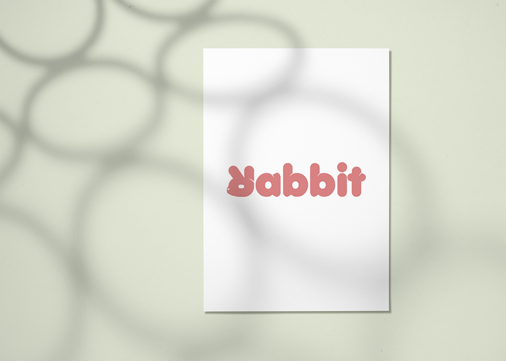
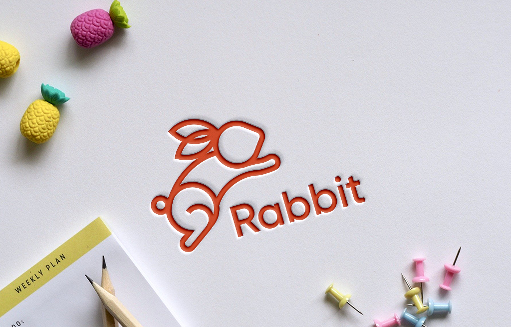
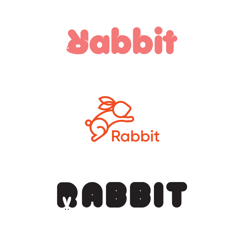
For the first mock-up, I creatively flipped the letter “R” upside down and transformed its legs into rabbit ears. This concept captured the essence of the name while maintaining a playful design. The second mock-up incorporated a vibrant orange color, reflecting the youthful energy I sensed from the client. In this version, I integrated a turnip to represent the rabbit’s head, linking the logo more directly to the playful imagery associated with rabbits.

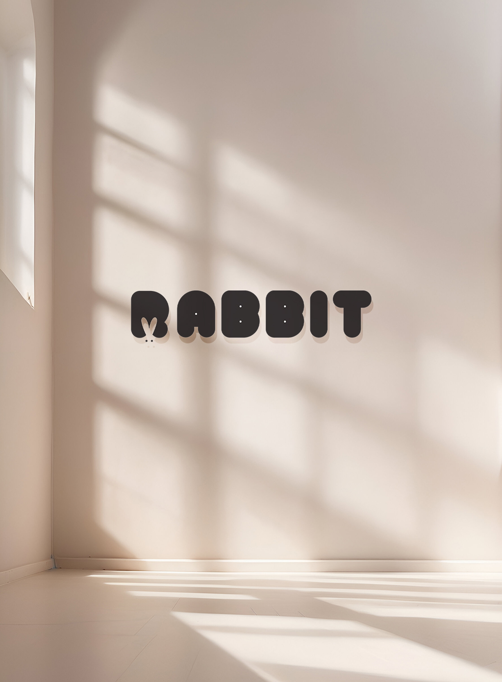
In the final mock-up, I decided to take a different approach by utilizing negative space. Instead of depicting an actual rabbit icon, I created a design where the top of the rabbit peeks out from the bottom of the letter “R.” This design choice not only adds a unique twist but also enhances the logo’s cool and edgy vibe by using a bold black color.

Are you in need of a distinctive logo design for your company? Let’s connect today and bring your vision to life!
