Mamiko, a brand-new startup specializing in baby and children’s care products, approached me for a complete branding solution. They needed both a logo design and a cohesive series of packaging designs to represent their wide range of products and establish a strong, recognizable brand identity from the ground up.
Logo Design: Childlike, Friendly, and Aspirational
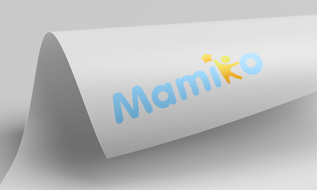
We started with the logo. During our discussions, the client emphasized the need for a versatile design that would resonate with both parents and children while accommodating a variety of products. I created a logo featuring rounded, soft fonts to evoke a child-friendly and approachable vibe.
The centerpiece of the design was a unique detail: the letter “K” was transformed into a playful child figure, reaching for a star. This not only symbolized excellence and aspiration but also aligned with Mamiko’s vision of nurturing children to reach their full potential.
Packaging Design: Distinct Yet Unified
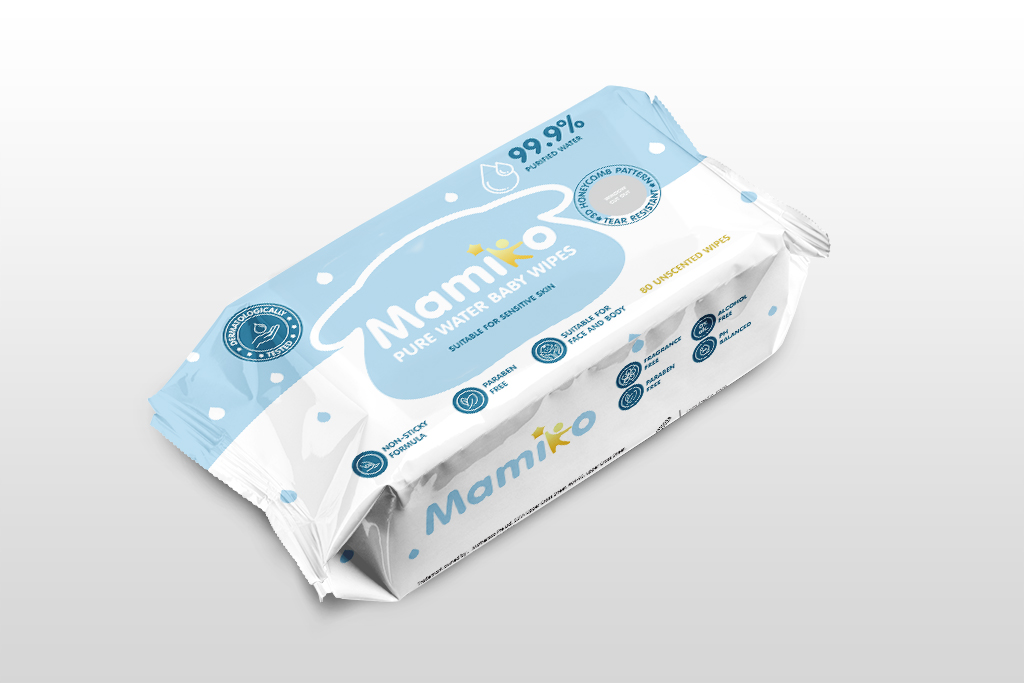
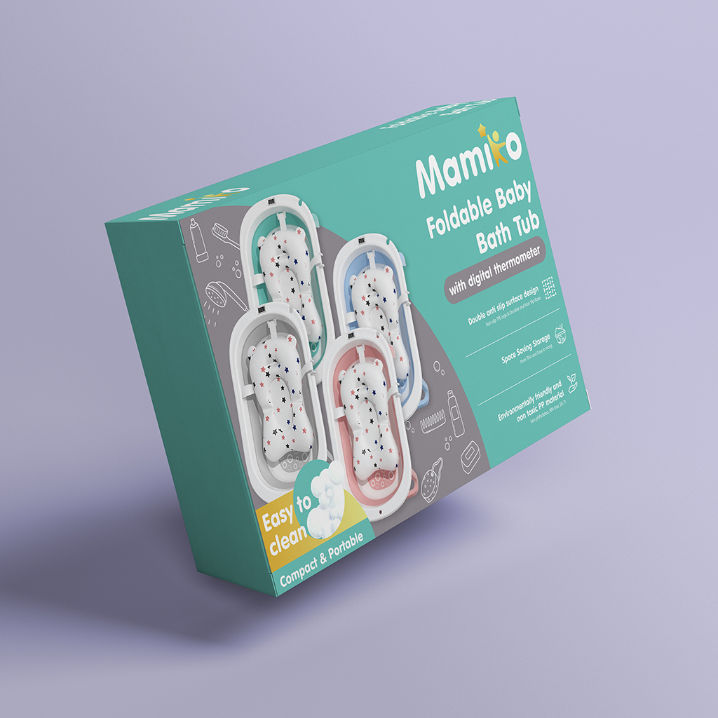
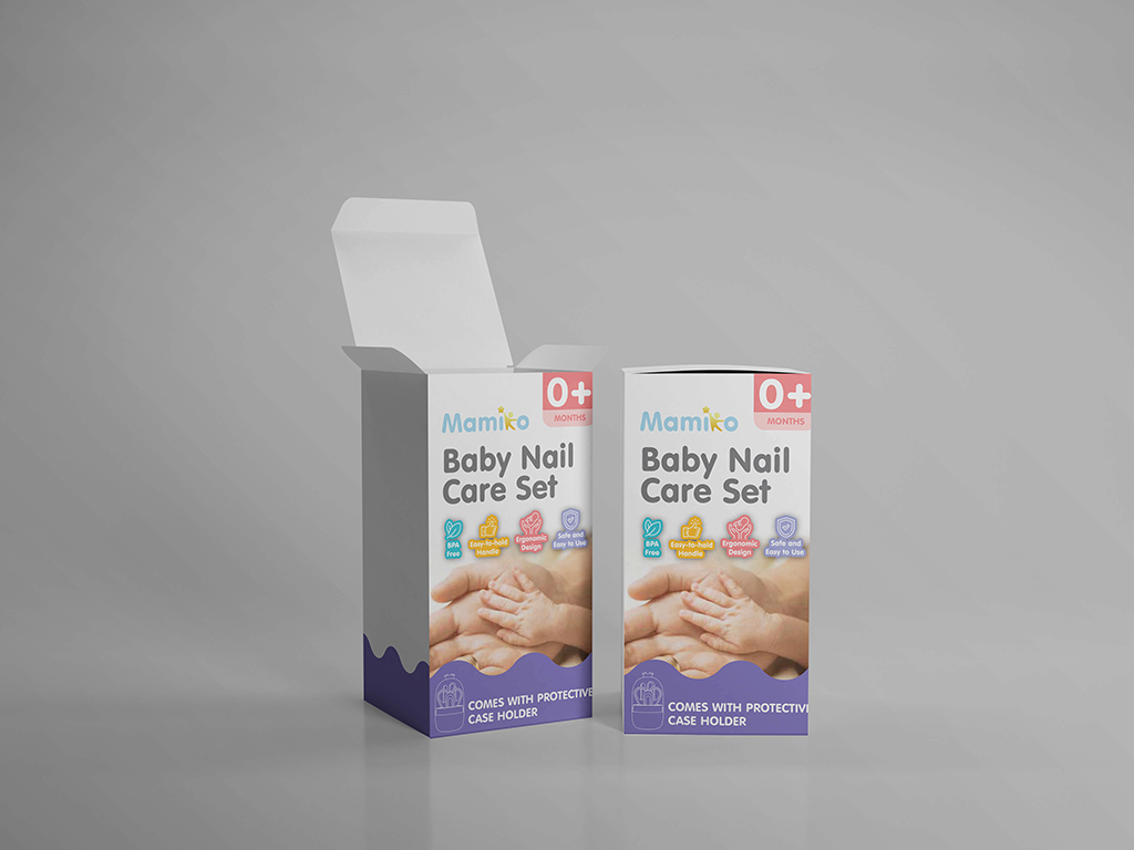
With the logo complete, the next step was designing the product packaging. The challenge was to ensure that each product had its own distinctive look while maintaining consistency across the entire range to reinforce brand recognition.
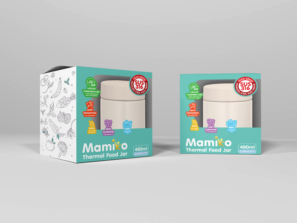
To achieve this, I developed a detailed branding guide that standardized the fonts and outlined a carefully curated color palette. This allowed each product’s packaging to feel unique but unmistakably part of the Mamiko family.
Results
The final designs brought Mamiko’s brand identity to life. The cohesive packaging and logo became a strong foundation for the startup, helping them make a memorable impression in a competitive market. The client was delighted with the results and felt confident in their ability to position Mamiko as a trusted name in baby and children’s care.
Do you need professional branding and packaging design to elevate your business? Let’s create something amazing together—contact me today!
