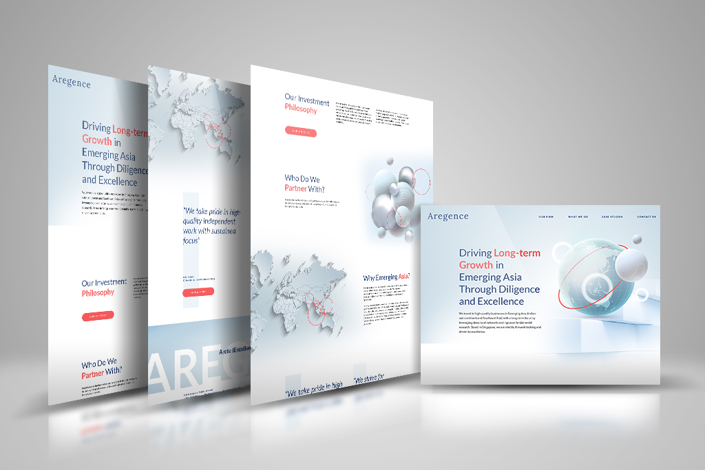
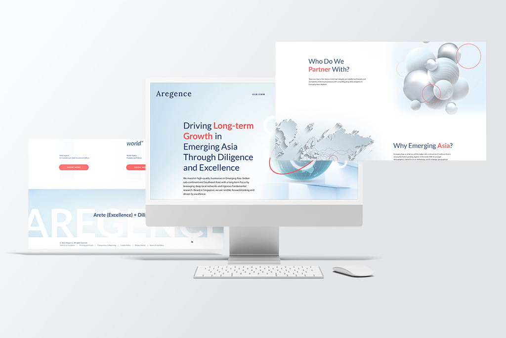
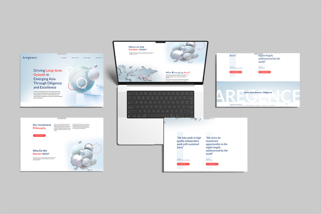
This project highlights a finance website design created for a new finance investment client. As a startup, the company had limited information available, but it was essential for them to establish a strong online presence that would make a positive impression on potential clients. To achieve this, I proposed a one-page scrolling website that allows users to easily navigate through the content while maintaining an engaging visual experience.

In crafting the financial website design, I focused on utilizing typography, negative space, and dramatic graphics to create a welcoming atmosphere. These design elements not only enhance readability but also guide visitors through the site seamlessly. By balancing the layout with thoughtful use of white space, the website feels open and inviting, which is crucial for a finance-related business aiming to build trust with clients.

To infuse energy and a forward-thinking attitude into the site, I chose a vibrant peach-red accent color that runs consistently throughout the design. This bold color choice adds a modern touch and helps the brand stand out in a competitive industry. Coupled with the striking visuals, the color enhances the overall user experience, making the site not just informative but also visually appealing.

If you’re looking for a professional finance website design that combines aesthetics with functionality, let’s connect! Together, we can create a website that effectively represents your brand and captivates your audience.
