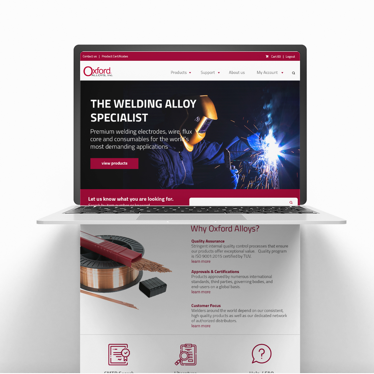
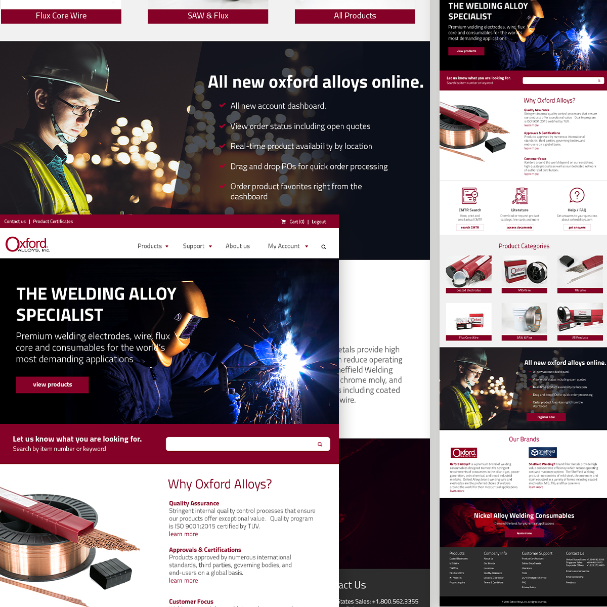
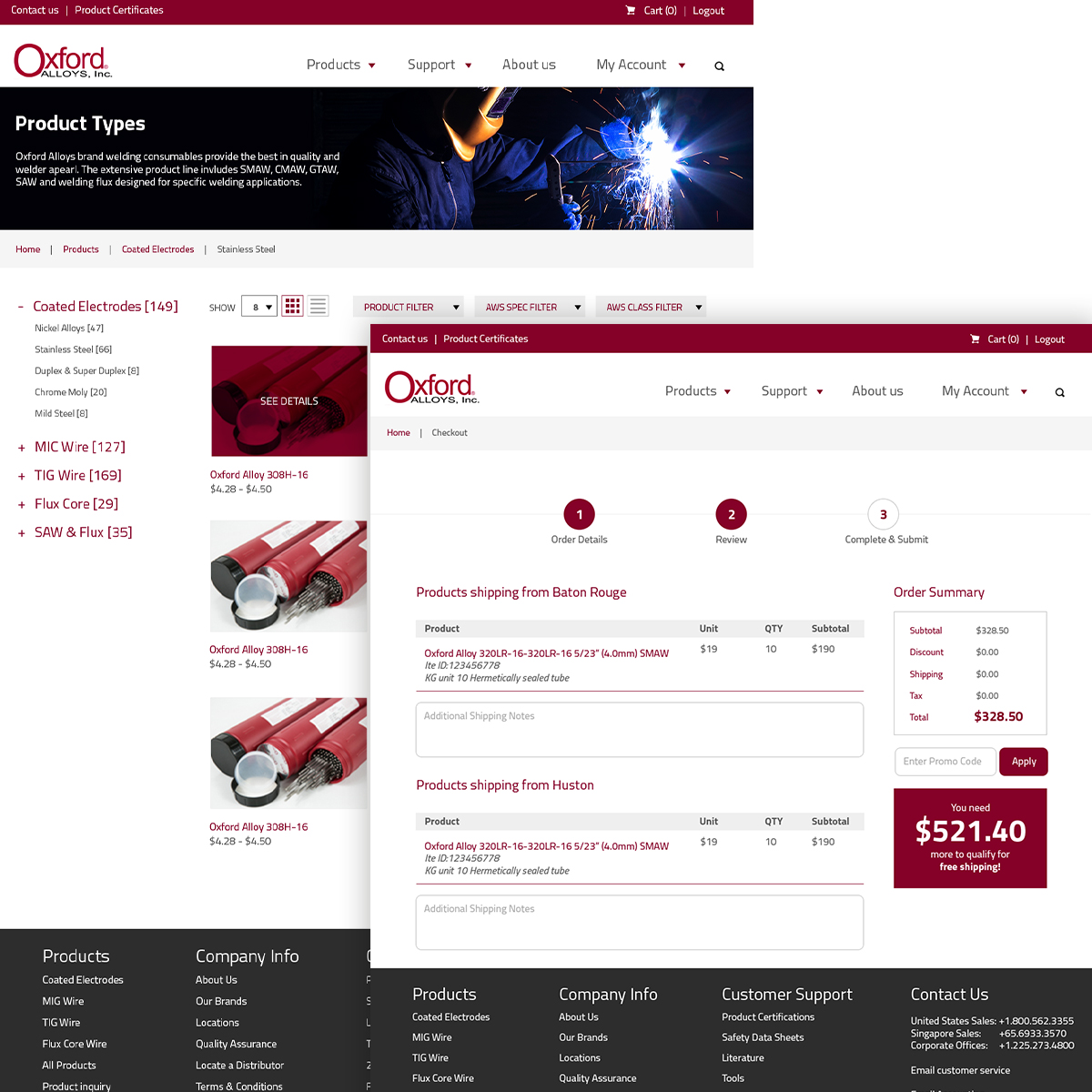
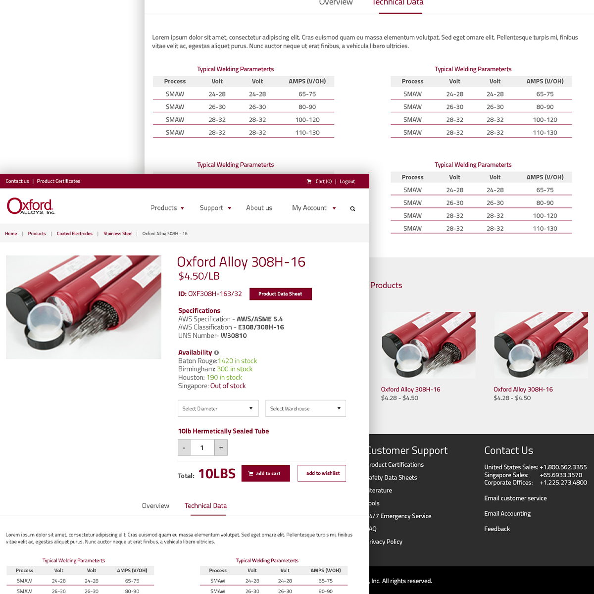
Oxford Alloys needed a new website that looks more kept up with time as it has been a long time since they last updated their site. They wanted something fresh and modern and kept to their branding as well.


First we sat together to work out a wireframe that works for Oxford Alloy. We took into consideration on how their customer use their site and aim to make the whole thing more user friendly by allowing them to get to the page they want with as little clicks as possible.

Then I proposed a few home page designs for them to make sure that we are in the right direction and for me to get a feel of what works and what does not work for my client.

