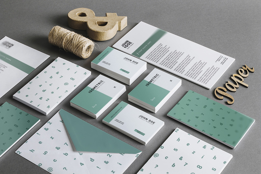
So, you’ve got yourself a fancy business, you know exactly what you’re offering, and your vision and mission are on point. But, uh-oh, you’re staring at the mirror thinking, “How in the world do I brand myself?” Fear not, my friend, because Super Serene is swooping in to the rescue. Yes, it’s kind of a big deal, especially before you go hiring a designer to craft a logo for you. You can’t just stroll up to them and say, “Hey, I’ve got this chicken rice stall; design me a logo that magically sells more chicken rice.”
I mean, as much as I’d love my logos to have that kind of power, let’s face it, logos aren’t wizards. So, before I dive into logo-land, I always hit my clients with these 3 super important questions.
- What’s Your Story? Let’s get real; there’s not much that’s totally original in this world. But, guess what? Your business story is unique. Your brand should be the storyteller-in-chief. Take the chicken rice scenario, for instance. Maybe it’s because your grandma whipped up this extraordinary chicken rice that’s nothing like the usual Singaporean fare. You want to honor her legacy. So, your brand revolves around Ah Ma, and from there, you spin a tale that sets your chicken rice stall apart from the rest.Example: Ya Kun Toast Everyone’s slinging kaya toast and soft-boiled eggs, but Ya Kun sticks because they’ve got a captivating story behind their business.
- What’s Your Vision Mission? Basically, what are your grand plans for your business? What’s the big dream? What’s your motivation? Take Eighteen Chef, for instance; their mission is to inspire troubled youths and those with a record, helping them reintegrate into society. So, the owner named the restaurant Eighteen after his late father’s gang. Talk about a story!
- Who’s Your Audience? Obviously, if you’re selling to kiddos versus selling to the seniors, your design vibe is gonna be worlds apart. Take a sec to figure out your target audience. If you’re opening a kindergarten, your end-users are the kiddos, but the decision-makers are the parents. So, maybe not too informal and kiddish—opt for something fun but still a tad formal. Something that says, “Your kids are safe with us!”My First Skool did this right. Check out their website; it’s not all cartoonish and childish. All the info parents need is there, with rounded fonts giving off friendly vibes. The logo? A little sprout symbolizing growing children and the need to nurture them. And they even spell “school” as “skool,” mimicking how little children might spell. Genius, right?
So, my friend, follow these soul-searching steps, and voila! You (and me, as your designer) will whip up a personal brand that’s as strong and authentic as a superhero cape. Need a hand with your branding? Click here and let’s dive into this branding adventure together!
